People decide whether an app feels good within the first few taps. Most of that feeling comes from small details that behave the same way every time, and very little of it comes from big animations.
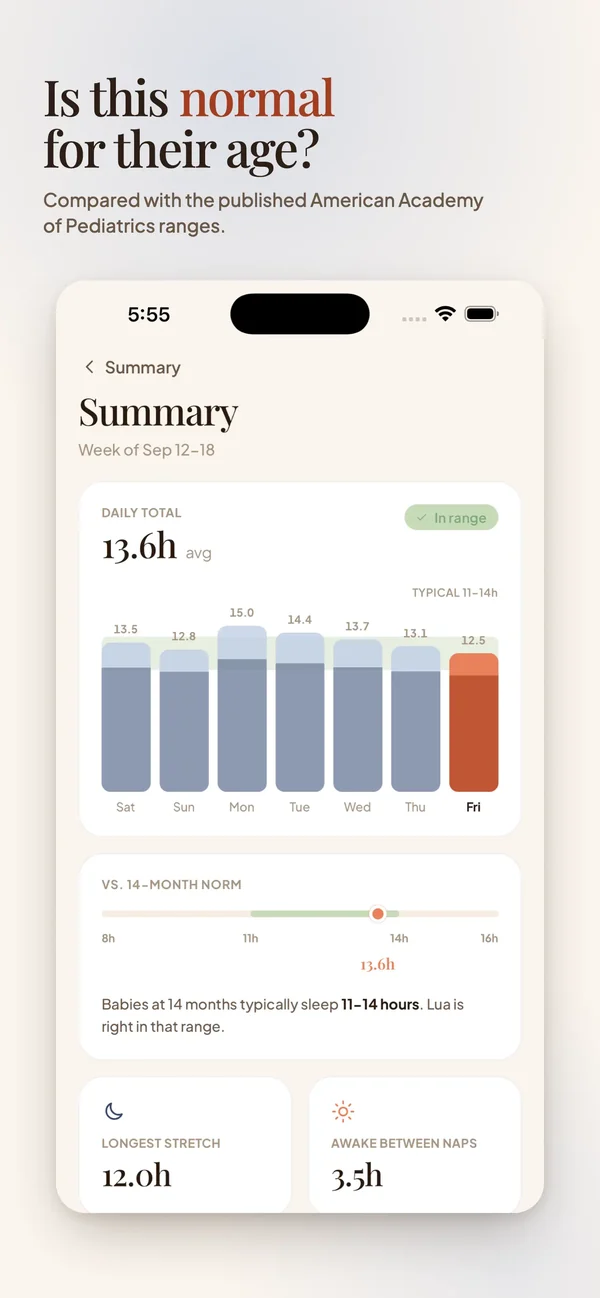
Here is what we pay attention to when we design an app, with examples from Lyapp, the baby tracker we shipped this year.
Big targets for one hand
Apple recommends tap targets of at least 44 by 44 points, and Material Design uses 48 by 48 dp. Size is only half of it: placement matters too. Most people hold the phone in one hand, so the main actions belong where the thumb reaches without stretching.
- Easy: main actions
- Stretch: secondary actions
- Hard: settings, rare actions
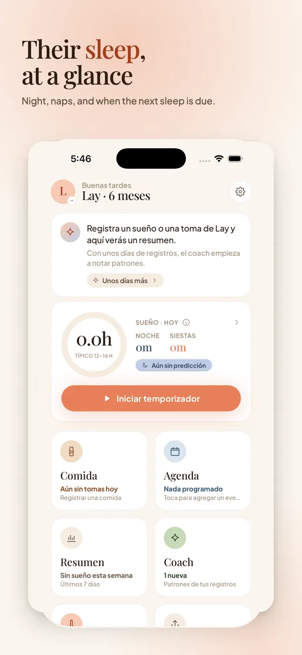
In Lyapp the main action, starting the sleep timer, is a wide button in easy reach, because the other arm is usually holding a baby.
Feedback within a tenth of a second
A tap should change something on screen right away. Around 0.1 seconds feels instant, so the pressed state, a highlight or a small haptic should appear within that time, even if the real work takes longer. If it takes more than a second, show progress.
State that follows you
A running timer shouldn't disappear when the app closes. Lyapp keeps it on the Lock Screen and in the Dynamic Island through Live Activities, so parents can check it without opening the app. Start the timer below and lock the phone:
Empty states that help
The first time someone opens an app, most screens are empty. An empty list with nothing on it looks broken. A short sentence that explains what will appear there and one button to add the first item turns that moment into a starting point.
Consistency over flourish
When the start button always looks and responds the same way, people stop thinking about it. Use one easing curve and a small set of durations across the app, keep icons in one style, and save the bigger moments of motion for things worth celebrating, like finishing setup.